Graphic Design
ZERO7
A complete visual identity for the fictional music band Zero7, developed through logo design, branding guidelines, and a promotional poster that unifies typography, color, and composition.
Year :
2025
Industry :
Graphic Design
Client :
Collège de Bois-de-Boulogne
Project Duration :
8 weeks

OBJECTIVE :
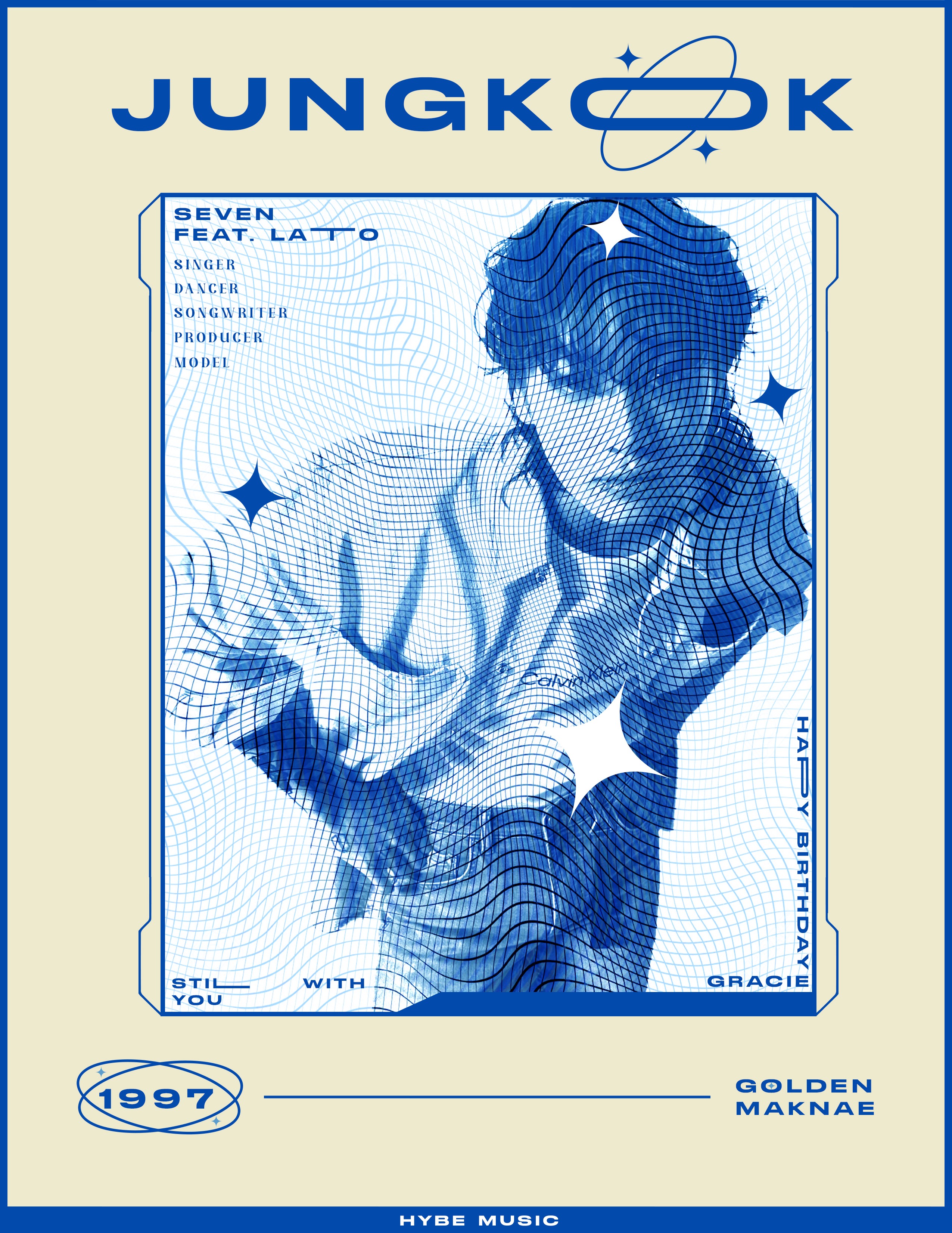
This project focused on developing a complete visual identity for a fictional music band called Zero7. After finalizing the logo and building a graphic standards manual, the next step was to design a promotional poster. The assignment was an opportunity to apply the design principles and techniques learned throughout the semester in a creative and strategic way.
The process began with exploratory sketches and drafts, which helped establish the visual direction of the poster. Illustrator was used as the main tool for creating clean, scalable vector elements, while Photoshop was incorporated to refine images and add effects. All design assets, including image sources and typefaces, were carefully documented and included in the final project folder to ensure consistency and transparency.
The final poster reflects the core identity of Zero7 through deliberate choices in color, typography, and composition. The design balances clarity with impact, aiming to capture attention while staying true to the aesthetic values defined in the graphic standards manual.


INITIAL IDEA AND INTENT :
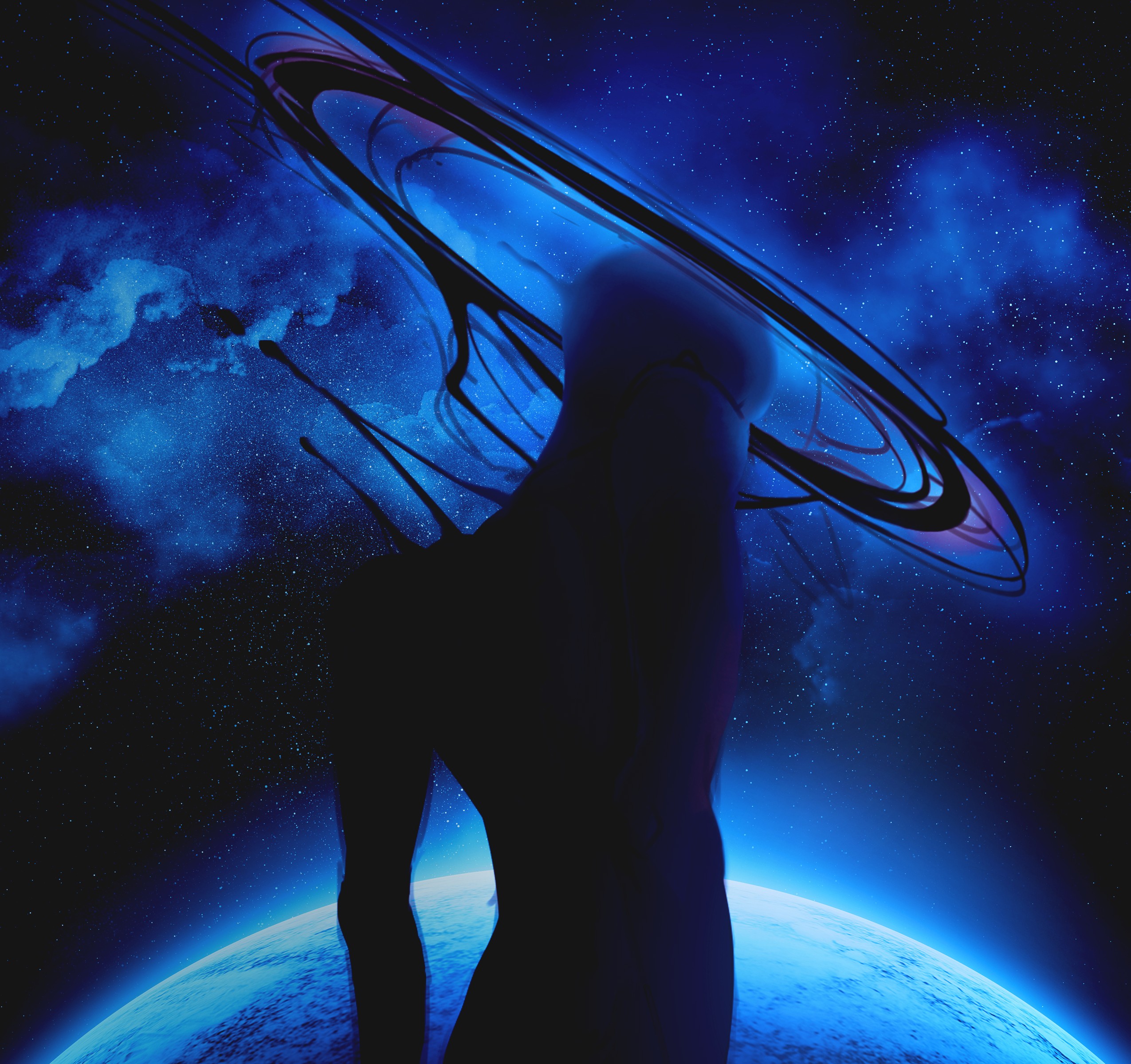
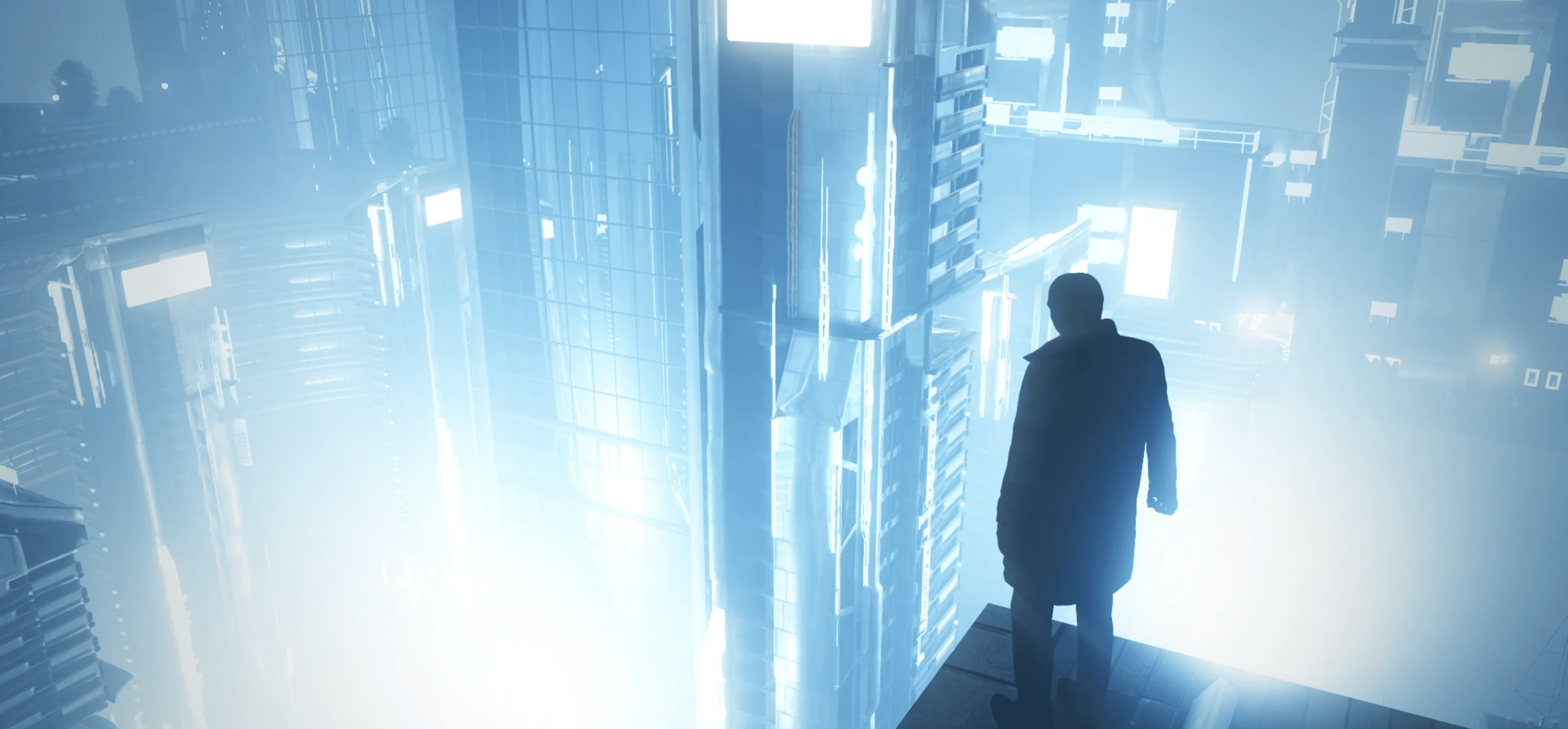
Zero7 is a dynamic seven-member music group exploring the K-R&B genre. To establish their identity and connect with their audience, they required a visual identity that would capture the euphoria of dreams and the joy that radiates from their music, as well as from life’s happiest moments. The goal was to create a brand that conveyed a dreamlike dimension, encouraging listeners to let go of their worries and fully embrace the present.
The logo was built around symbolic elements that reinforce this vision. The inverted letter “E” contains a star representing the moon, while a shooting star suggests serendipity and euphoria, both aligned with the theme of dreams. The letter “O” was stylized to resemble a flower, symbolizing freshness, renewal, and the sense of happiness that comes with spring.
Typography played a key role in shaping the identity. The pairing of “Stretch Pro” and “Against” fonts strikes a balance between professionalism and creativity, reinforcing the dreamy and euphoric spirit of the band while maintaining a strong and recognizable look.
The color palette supports this direction through two shades of blue paired with white. Blue reflects the night and the dreamlike quality of Zero7’s music, while white evokes the moon and stars, providing contrast and clarity. Together, these choices enhance the logo’s impact and communicate the atmosphere the band wants to project.
Through its dream-inspired design and carefully considered visual elements, the identity successfully represents Zero7 and translates their musical essence into a cohesive visual language.


Challenge :
The main challenge of this project was to translate the band’s abstract concepts of dreams, euphoria, and joy into a clear and functional visual identity. Because Zero7 is a fictional group, there was no pre-existing aesthetic to draw from, which meant building an entire identity system from scratch. Another difficulty was striking the right balance between a professional look that could stand in the real music industry and a playful, creative tone that reflects the group’s artistic spirit. Choosing symbols and typography that felt both original and cohesive required several iterations of sketches, vector explorations, and color studies.
Solution :
The solution was to approach the project by combining symbolic imagery with strategic design principles. By integrating dreamlike elements such as the inverted “E” with a star and the stylized “O” as a flower, the logo achieved both originality and narrative depth. Careful typography pairing provided structure while still allowing for creativity, and the blue-and-white palette reinforced the band’s ethereal, night-inspired theme. Iterating through multiple sketches and digital drafts helped refine the direction, ensuring every design decision tied back to the band’s identity. The result was a consistent and versatile brand system that could extend naturally into a promotional poster and other visual applications.
More Projects


Graphic Design
ZERO7
A complete visual identity for the fictional music band Zero7, developed through logo design, branding guidelines, and a promotional poster that unifies typography, color, and composition.
Year :
2025
Industry :
Graphic Design
Client :
Collège de Bois-de-Boulogne
Project Duration :
8 weeks
OBJECTIVE :
This project focused on developing a complete visual identity for a fictional music band called Zero7. After finalizing the logo and building a graphic standards manual, the next step was to design a promotional poster. The assignment was an opportunity to apply the design principles and techniques learned throughout the semester in a creative and strategic way.
The process began with exploratory sketches and drafts, which helped establish the visual direction of the poster. Illustrator was used as the main tool for creating clean, scalable vector elements, while Photoshop was incorporated to refine images and add effects. All design assets, including image sources and typefaces, were carefully documented and included in the final project folder to ensure consistency and transparency.
The final poster reflects the core identity of Zero7 through deliberate choices in color, typography, and composition. The design balances clarity with impact, aiming to capture attention while staying true to the aesthetic values defined in the graphic standards manual.
INITIAL IDEA AND INTENT :
Zero7 is a dynamic seven-member music group exploring the K-R&B genre. To establish their identity and connect with their audience, they required a visual identity that would capture the euphoria of dreams and the joy that radiates from their music, as well as from life’s happiest moments. The goal was to create a brand that conveyed a dreamlike dimension, encouraging listeners to let go of their worries and fully embrace the present.
The logo was built around symbolic elements that reinforce this vision. The inverted letter “E” contains a star representing the moon, while a shooting star suggests serendipity and euphoria, both aligned with the theme of dreams. The letter “O” was stylized to resemble a flower, symbolizing freshness, renewal, and the sense of happiness that comes with spring.
Typography played a key role in shaping the identity. The pairing of “Stretch Pro” and “Against” fonts strikes a balance between professionalism and creativity, reinforcing the dreamy and euphoric spirit of the band while maintaining a strong and recognizable look.
The color palette supports this direction through two shades of blue paired with white. Blue reflects the night and the dreamlike quality of Zero7’s music, while white evokes the moon and stars, providing contrast and clarity. Together, these choices enhance the logo’s impact and communicate the atmosphere the band wants to project.
Through its dream-inspired design and carefully considered visual elements, the identity successfully represents Zero7 and translates their musical essence into a cohesive visual language.
Challenge :
The main challenge of this project was to translate the band’s abstract concepts of dreams, euphoria, and joy into a clear and functional visual identity. Because Zero7 is a fictional group, there was no pre-existing aesthetic to draw from, which meant building an entire identity system from scratch. Another difficulty was striking the right balance between a professional look that could stand in the real music industry and a playful, creative tone that reflects the group’s artistic spirit. Choosing symbols and typography that felt both original and cohesive required several iterations of sketches, vector explorations, and color studies.
Solution :
The solution was to approach the project by combining symbolic imagery with strategic design principles. By integrating dreamlike elements such as the inverted “E” with a star and the stylized “O” as a flower, the logo achieved both originality and narrative depth. Careful typography pairing provided structure while still allowing for creativity, and the blue-and-white palette reinforced the band’s ethereal, night-inspired theme. Iterating through multiple sketches and digital drafts helped refine the direction, ensuring every design decision tied back to the band’s identity. The result was a consistent and versatile brand system that could extend naturally into a promotional poster and other visual applications.
More Projects
Graphic Design
ZERO7
A complete visual identity for the fictional music band Zero7, developed through logo design, branding guidelines, and a promotional poster that unifies typography, color, and composition.
Year :
2025
Industry :
Graphic Design
Client :
Collège de Bois-de-Boulogne
Project Duration :
8 weeks
OBJECTIVE :
This project focused on developing a complete visual identity for a fictional music band called Zero7. After finalizing the logo and building a graphic standards manual, the next step was to design a promotional poster. The assignment was an opportunity to apply the design principles and techniques learned throughout the semester in a creative and strategic way.
The process began with exploratory sketches and drafts, which helped establish the visual direction of the poster. Illustrator was used as the main tool for creating clean, scalable vector elements, while Photoshop was incorporated to refine images and add effects. All design assets, including image sources and typefaces, were carefully documented and included in the final project folder to ensure consistency and transparency.
The final poster reflects the core identity of Zero7 through deliberate choices in color, typography, and composition. The design balances clarity with impact, aiming to capture attention while staying true to the aesthetic values defined in the graphic standards manual.
INITIAL IDEA AND INTENT :
Zero7 is a dynamic seven-member music group exploring the K-R&B genre. To establish their identity and connect with their audience, they required a visual identity that would capture the euphoria of dreams and the joy that radiates from their music, as well as from life’s happiest moments. The goal was to create a brand that conveyed a dreamlike dimension, encouraging listeners to let go of their worries and fully embrace the present.
The logo was built around symbolic elements that reinforce this vision. The inverted letter “E” contains a star representing the moon, while a shooting star suggests serendipity and euphoria, both aligned with the theme of dreams. The letter “O” was stylized to resemble a flower, symbolizing freshness, renewal, and the sense of happiness that comes with spring.
Typography played a key role in shaping the identity. The pairing of “Stretch Pro” and “Against” fonts strikes a balance between professionalism and creativity, reinforcing the dreamy and euphoric spirit of the band while maintaining a strong and recognizable look.
The color palette supports this direction through two shades of blue paired with white. Blue reflects the night and the dreamlike quality of Zero7’s music, while white evokes the moon and stars, providing contrast and clarity. Together, these choices enhance the logo’s impact and communicate the atmosphere the band wants to project.
Through its dream-inspired design and carefully considered visual elements, the identity successfully represents Zero7 and translates their musical essence into a cohesive visual language.
Challenge :
The main challenge of this project was to translate the band’s abstract concepts of dreams, euphoria, and joy into a clear and functional visual identity. Because Zero7 is a fictional group, there was no pre-existing aesthetic to draw from, which meant building an entire identity system from scratch. Another difficulty was striking the right balance between a professional look that could stand in the real music industry and a playful, creative tone that reflects the group’s artistic spirit. Choosing symbols and typography that felt both original and cohesive required several iterations of sketches, vector explorations, and color studies.
Solution :
The solution was to approach the project by combining symbolic imagery with strategic design principles. By integrating dreamlike elements such as the inverted “E” with a star and the stylized “O” as a flower, the logo achieved both originality and narrative depth. Careful typography pairing provided structure while still allowing for creativity, and the blue-and-white palette reinforced the band’s ethereal, night-inspired theme. Iterating through multiple sketches and digital drafts helped refine the direction, ensuring every design decision tied back to the band’s identity. The result was a consistent and versatile brand system that could extend naturally into a promotional poster and other visual applications.